Day 1: Map
Understand the problem through user research
Task: identify the problem through user research; generate insights; draft a map of the end-to-end user experience; begin recruiting participants for usability testing on Day 5. Information can come from anywhere and must be organized effectively.
RESEARCH INSIGHTS
User research consisted of surveying 9 users and completing an in-depth interview with 1 user, all of whom regularly use public spaces for remote work.
Users often take phone calls and do computer work between meetings
Users expressed a clear preference for quiet work spaces with amenities such as WiFi and public restrooms
Their pain points included finding convenient, welcoming locations and wanting to check places out before visiting
In-depth interview: user prioritizes low-cost options, checks photos for seating, wants to know when location is busiest, reads reviews, and compares 3 or 4 places before deciding
END-TO-END USER EXPERIENCE MAP
Remote worker: searches the map > opens location > opens reviews and compares > selects location > receives GPS directions = works in an optimal space
Day 2 - Sketch
Create solutions through brainstorming processes
Task: use brainstorming and sketching activities to create a finished sketch depicting a solution to the identified problem. This process consists of remixing old ideas rather than reinventing the wheel.
MODIFIED LIGHTING DEMO
I completed a modified lightning demo to take a look at solutions competitors have used to solve the problem, comparing solutions proposed by the Google Maps App and the WorkFrom website.
Google Maps
Google Maps lets users search based on current location and provides. Overall, this app is good for giving a user a general idea of which spaces are available, but may still requires digging through irrelevant information. Users may also ask specific questions of the community, but this may not be helpful on short notice.
Inspirations:
Accessible interface
User photos and local information—- some of which may be provided by other remote workers, but often not
“Popular times” gives an estimate of how crowded the space will be (but does not tell how many seats are open)


WorkFrom
This is an app specific to helping remote workers find spaces in which to work based on recommendations from other remote workers. This is ideal, as other remote workers will presumably have similar needs as the user.
Inspirations:
Suggestions from other remote workers, based on current location
Filters for amenities


CRAZY 8’S
With an understanding of the target user and inspiration from other apps, I began brainstorming solutions. I completed a Crazy 8s exercise, which consists of quickly sketching possible solutions. To pick the most critical screen to focus on, I asked myself the following questions:
At which step will the user complete the primary activity?
Which screen is most important for solving this problem?
Which screen is the most complex?

I selected the map screen as the most critical because this is where the user will receive information about their options. This is also where the user who was given an in-depth interview on Day 1, started her search.
SOLUTION SKETCH
To complete the solution sketch, I chose one of the Crazy 8s sketches to move forward with, depicting the screens both before and after it.

I choose this layout due to its effective use of space. The filters are hidden behind a hamburger menu and the suggested profiles are cards at the bottom of the screen. In this sequence, the user starts with the search bar, and ends up on a location profile.
Day 3 - Decide
Making informed design decisions
Task: expand the solution sketch with considerations being paid to UI and information architecture. Deciding consists of expanding the solution sketch from a 3 panel sequence to a 5-15 panel storyboard.
STORYBOARD
Looking at my solution in greater detail forced me to be more intentional with creating a logical red route and choosing UI elements. I spent considerable time thinking about how to organize the information that would be available, with special attention paid to which information would be featured under the hamburger menu and location profiles.

Day 4 - Prototyping
Creating a working model of the solution
Task: create a clickable prototype based on the red routes identified through the storyboarding process. This step involved fleshing out a quick, working prototype.
GOALS
The goal of the prototyping process is to create a working model that will elicit feedback from users. I tried to make this prototype as true to life as possible while being careful not to spend too much time on the details.
I built these screens using the storyboard as a reference, with UI elements taken from a kit. I hoped that this prototype would provide me with useful feedback for future iterations and tell me whether my design choices made the process of finding a new place to work easier.
Screens
The user starts with a location based landing page and uses a hamburger menu to set filters including distance, amenities, and noise level. These parameters are based in user research; this is the information users most want to know before traveling to a new place to work. Users have the option of either setting filters first, searching nearby, or using the search function.


Once users use the search function, they are given a card overlay with several options that scroll horizontally. These options reflect the user’s filters. Clicking on a card opens a profile for the location. The user is able to see the relative location of the destination via the map.


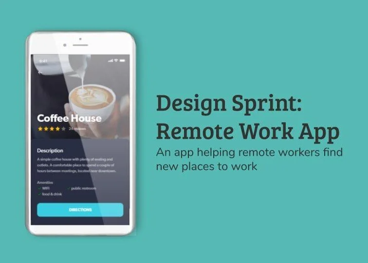
Location profiles include all relevant information for the user, including a basic description, reviews, photos, and a list of amenities. Users are able to get directions directly from this page once they have decided that this is the place that they would like to visit.

Users are able to look at photos and reviews in the process of making their decision. Reviews are designed to give users the most relevant information and include a list of positives about the location.


Users are able to look at photos and reviews in the process of making their decision. Reviews are designed to give users the most relevant information and include a list of positives about the location.


Day 5 - Validate
Receive user feedback informing future iterations
Task: interview 5 users to elicit feedback for future iterations. This process involved using Jake Knapp’s five-act interview technique with 5 users. According to Nielson Norman Group, a test group of 5 users is sufficient to identify nearly all usability issues.
PARTICIPANTS
I completed these steps in interviews with 5 users I began recruiting on Day 1. Each user works remotely and expressed frustration with the process of finding new places to do remote work. The users were three men and two women who ranged from 23 to 35 years old. Their jobs included sales, copyediting, web design, consulting, and graphic design.
OBSERVATIONS
Each user expressed excitement with the idea of the app, stating that this is a service that would be consistently helpful to them. Users appreciated the color scheme, which they thought seemed professional. However, users did not always interact with the app in the way I would have expected. Two users did not use the hamburger icon and therefore did not see that there were search filters there. Three users did not open the photo gallery by clicking on the photo at the top of the location profile.
Users also shared that there were certain aspects of the app that they would have liked to see added. One user expressed wanting to see x’s as well as checkmarks for each location. Another user remarked on wanting to filter for available seats in addition to seeing this metric on the location profile. Two users mentioned that they specifically need places for phone calls or meetings and would like to search based on the availability of private rooms or cubicles.
OPPORTUNITIES FOR ITERATION
In the next iteration, I will move the search filters into a more obvious place. While I moved them behind a hamburger icon to save space, they are at risk of being overlooked by the user. I will also add a “photo” button or arrows to photos at the top of the location profile, to make it more obvious that the user is able to open a photo gallery. I will also incorporate user feedback by adding filters for private spaces and seating, as well as adding a cons list to the profile.